Reimagining a core enterprise workflow
Overview
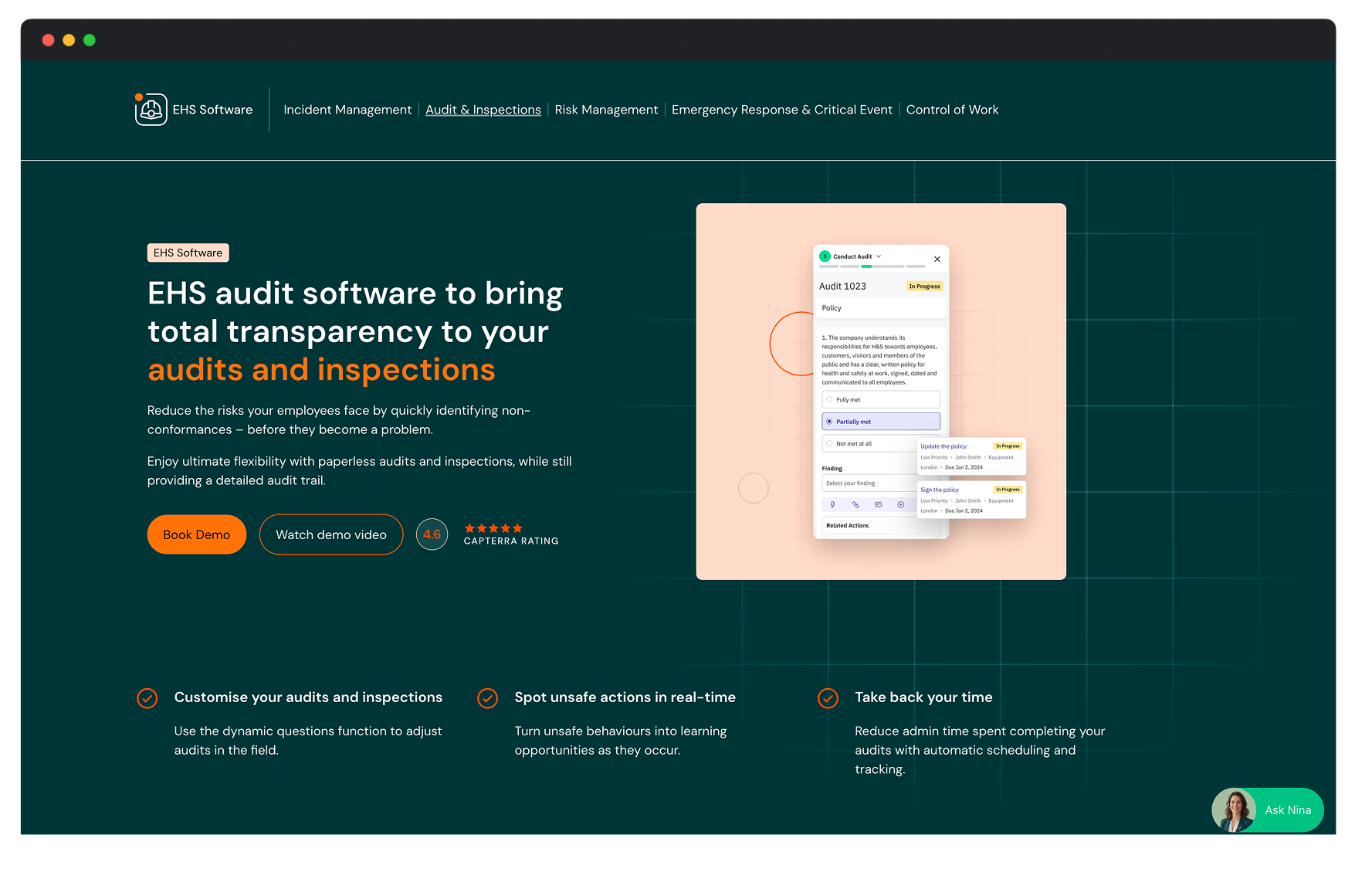
Audits and inspections are at the heart of health, safety, and compliance work. For frontline workers across construction sites, factories, and industrial environments, these are the daily operational tools used in demanding conditions where speed and clarity are everything.
EcoEHS Audit was one of EcoOnline's most heavily used modules. It was also one of the most outdated. Built up over many years, the experience had become fragmented, hard to learn, and poorly suited to the people who relied on it most.
The result was a complete ground-up reimagination of audits and inspections, setting new standards for UX patterns and behaviours across the portfolio. The new design became a sales driver, with customers seeing the value and winning us deals over competitors. But the most important outcome was how much easier it was for those who relied on it every day.
The Challenge
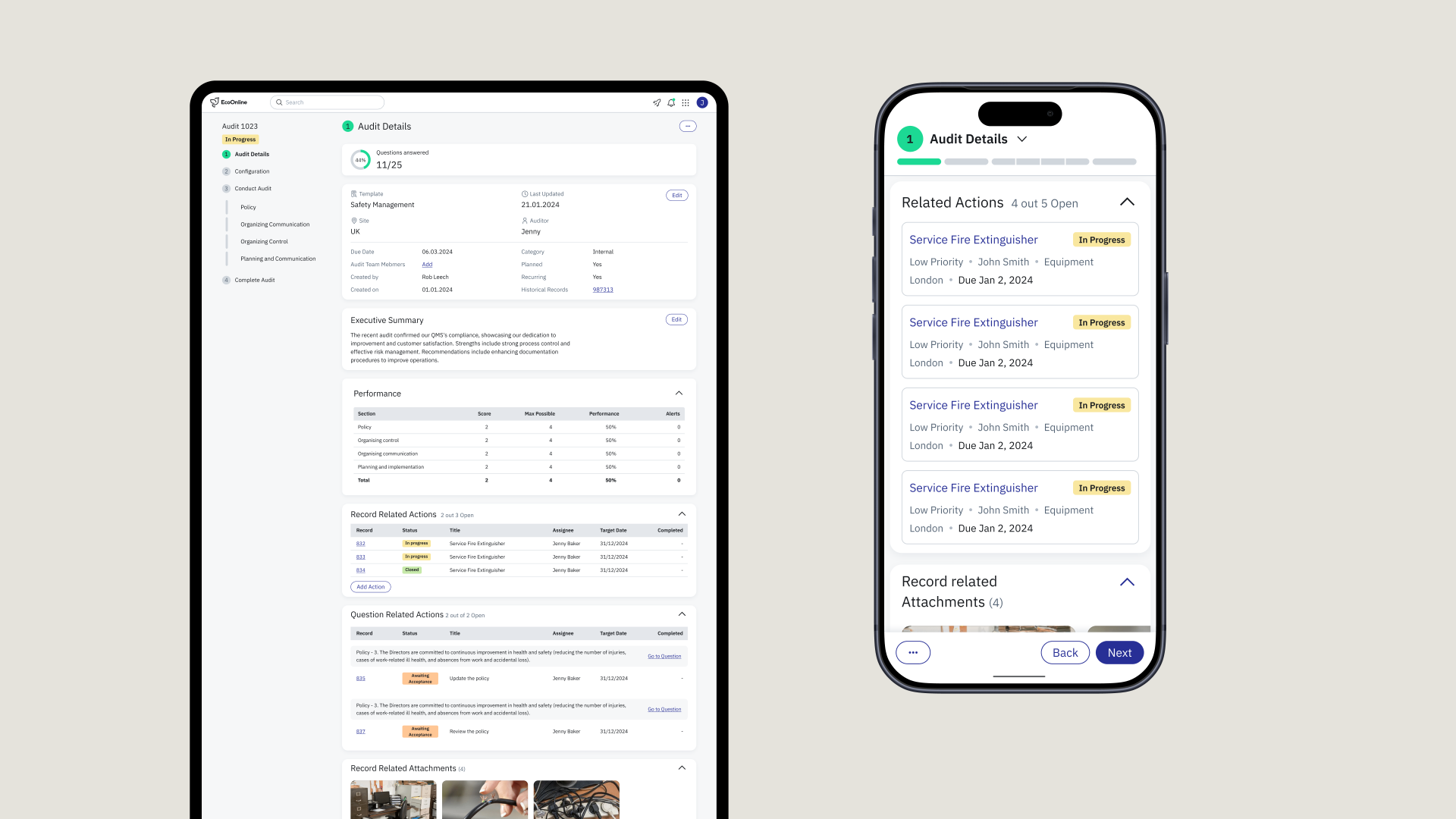
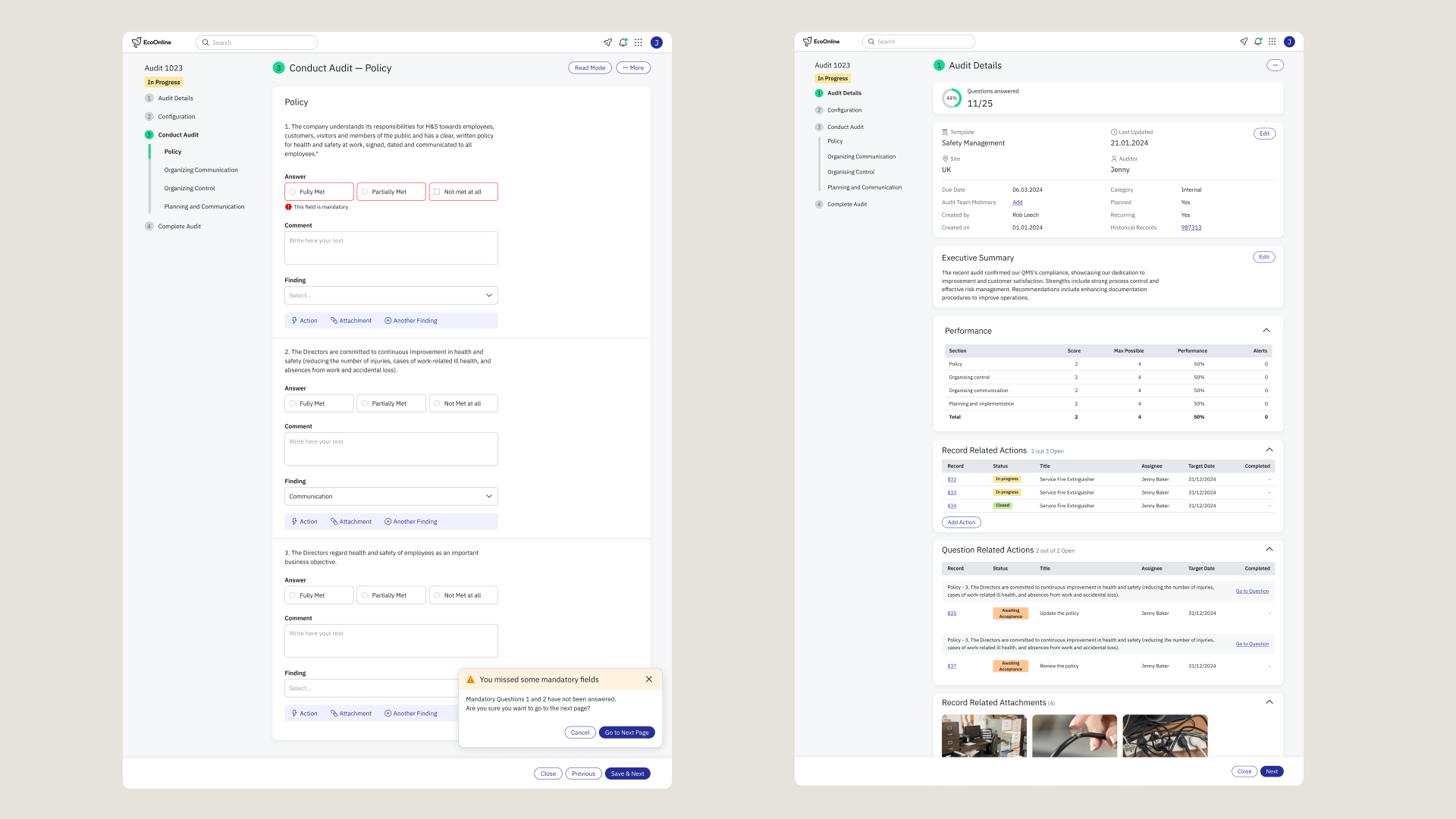
The existing experience had accumulated years of complexity. Workflows required too many steps. UX patterns were inconsistent across pages. Mobile usability was poor. The cognitive load on users who needed to move fast was significant.
The harder challenge was that Audit was business-critical, used daily across industries and countries. Modernising aggressively without disrupting trusted workflows required more than good design instincts. It required understanding how audits actually happened in the real world.
Approach
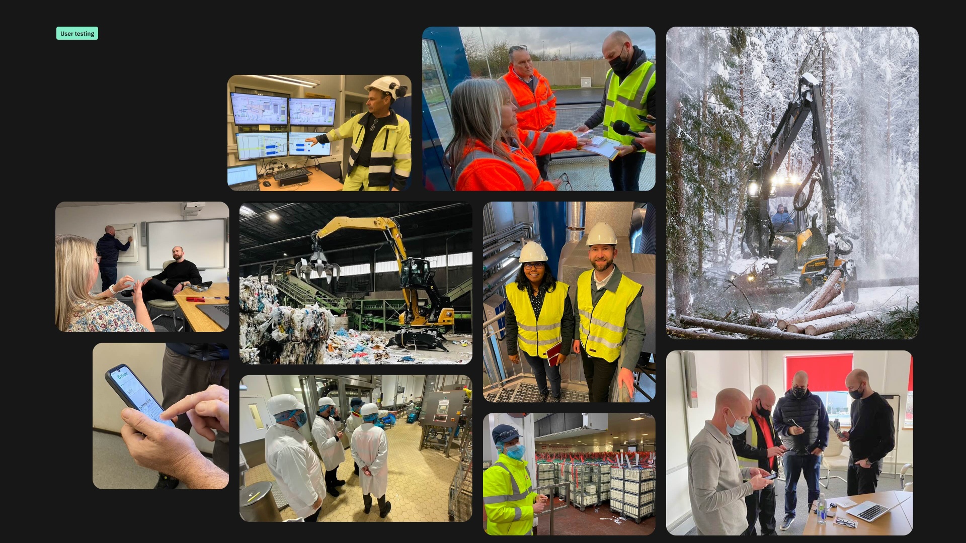
Frontline workers doing safety audits before operating heavy machinery don't have time to learn novel interaction patterns. They're cold, often wearing thick gloves, sometimes working in low light or under pressure. The bar for usability isn't intuitive for someone at a desk. It's intuitive for someone who needs to get through a checklist in two minutes before starting a shift.
A few specific observations shaped the design direction more than anything else.
In Finland, we tested prototypes with forestry workers in cold weather. They were wearing mittens with a conductive tip for touchscreens, but our tap targets were too small to use reliably. We redesigned the core interaction elements to be significantly larger, something that improved usability across the board, not just in cold climates.
For image capture, we scrapped any custom upload flow and modelled the interaction directly on camera behaviour people already knew from Instagram and Snapchat. Familiar patterns in high-pressure environments save time and reduce errors. That's not a small thing when someone is documenting a safety risk on an active construction site.
We also found that voice-to-text became unexpectedly important. Frontline workers often write briefly in forms, partly from time pressure, partly because writing on a phone in difficult conditions is genuinely hard. Some workers had accessibility needs that made typing slow and frustrating. When we introduced voice input, the quality and length of audit notes improved significantly. People wrote more when they didn't have to type.
These cases were the reality of designing for people doing critical work in difficult conditions.
Outcome
The redesign became more than a UX improvement. It became a commercial asset.
The new Audit experience was regularly highlighted in sales conversations and customer demos, its speed and clarity a visible contrast to the legacy enterprise tools EcoOnline competed against. It contributed directly to signed deals.
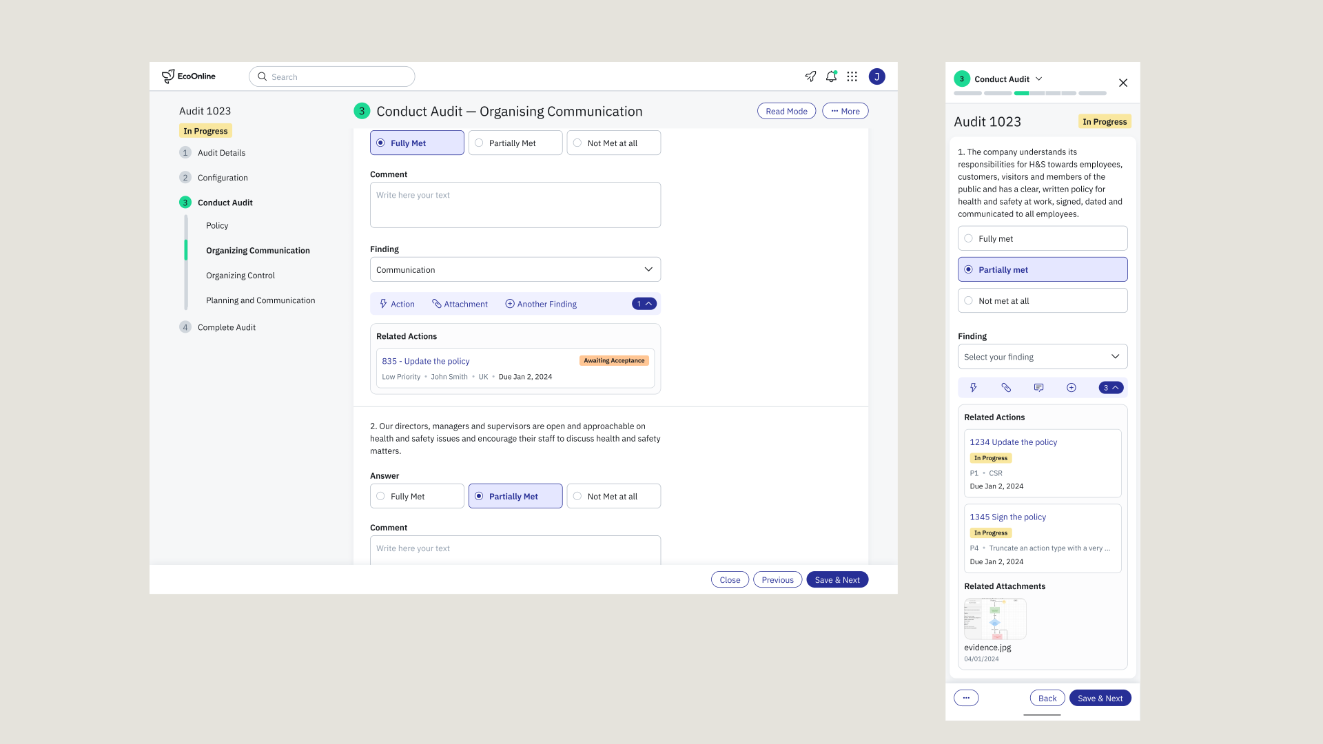
Internally, the project became a template. The patterns we developed, including stepper flows, maximum content per page, image capture, voice input, task assignment, and file handling, were adopted across the wider EcoOnline portfolio and became part of the foundation Prism was built on.
A module redesign that started as a usability problem ended up shaping how the whole platform thinks about experience.
Reflection
The biggest UX opportunities in enterprise software are rarely visual. They come from getting close enough to real operational workflows to understand what's actually hard, and having the conviction to solve for that rather than what looks good in a demo.
Designing for frontline workers taught me that accessibility and usability aren't separate concerns. When you design for the hardest conditions, cold hands, time pressure, noisy environments, small screens, you make the experience better for everyone.